The 'AA' group poster will be quite simple and hang on the wall during the meeting. I think that a red (for Hell) and a blue (for Heaven) 'A' will look good, accompanied by a phrase to explain the group.
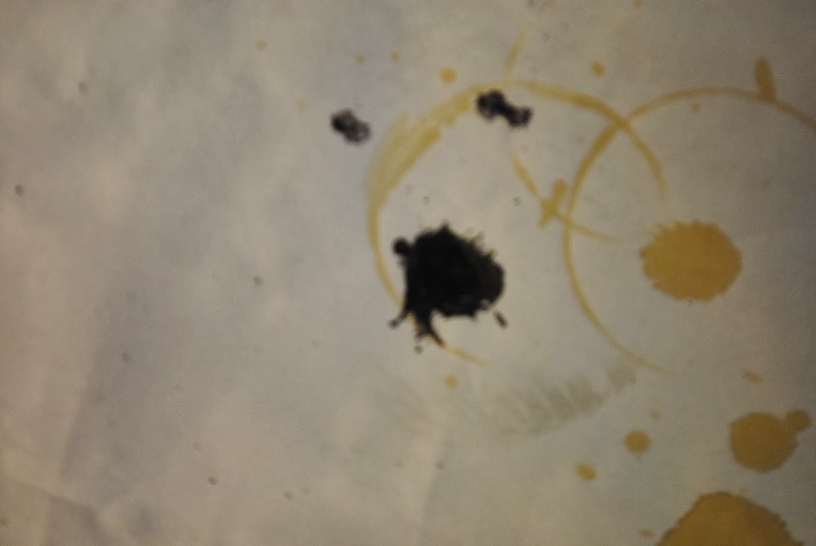
The 'Welcome to Purgatory' poster will look absolutely terrible, this is to accentuate the laziness of St Peter as he has supposedly made it. I think it should have coffee stains, footprints, rips and ink blots to really put this across.
The Heaven and Hell signs will be quite small and go at the top and bottom of the lift. The Heaven sign will have cotton wool surounding a white or blue glitter 'Heaven' to make it look Heavenly. The Hell sign will be red and orange (firey colours) and have the word written in red glitter surrounded by flames to make it look Hellish.
My Purgatory poster:
As you can see it looks pretty bad. You might go so far as to say terrible. Which it is. Saint Peter made it, and as he's lazy in the trailer there's many things wrong with this poster (done on purpose by me):
Number 1 - Coffee Stains
I reckon that Saint Peter (If he was as he is in the trailer) used this poster as a coffee coaster for a bit. As you can see there's loads of coffee rings and splats everywhere, cause he probably spilt it or something.
Number 2 - Frayed Edges
I don't know how this one would have happened. But I guess the paper's old or something. Or it was dragged along the floor, or (this is what I did) it got wet and ripped, or he hung it out the window as a bit of a flag for fun (That's probably how it got crinkled). Who knows?
Number 3 - Messy Writing
Saint Peter's got some messy writing. Plus he wanted it to be seen. So he went over and over it, eventually it just looked like a scribbled thing. Also it's been gone over with board marker in most places. But he couldn't be bothered I guess, so he just scribbled it in his worst handwriting.
Number 4 - Grammatical Errors
Here we have a series of grammatical errors. First, the word 'you're'. Obviously it's the wrong 'you're' cause the right one is 'your'. Also the word stay has an 'e' at the end of it, which is wrong. There's more mistakes too cause he can't spell (or he's too lazy to spell). But hey ho, Saint Peter most likely didn't go to school 'back in the day'.

Number 5 - Missing out letters
He missed out the letter 'O' when writing 'Welcome'. But he realised his grammatical error here and put in an 'O' with an arrow. So it's ok. However, it doesn't look great on a poster (which is why I did it for this particular one).
Number 6 - Ink Blots
I think his pen must have broken (I cut one open) at this point, so there's ink blots everywhere (Cause I splatted them).
Number 7 - Rips
I reckon the paper must have been used before, or maybe Saint Peter ripped it when he was using it as a coaster, or waving it out the window like a flag. Either way, he never tried to fix it. He didn't even put selotape over the rips.
Number 8 - Footprints
Now, as this poster is a very long (It's basically a banner) it was most likely used as a carpet or something. Maybe they were using it as a welcome mat at some point, or maybe they wanted a carpet runner. Or maybe he used it to stamp out his frustration - cause he hates his job so much.
Heaven Sign:
This is the Heaven sign to go at the top of the lift. It is cardboard painted blue (Linking to connotations of Heaven - in the sky - blue) and it has white gliter with white cotton wool surrounding each letter (Clouds). Hell Sign:
This is the Hell sign to go at the bottom of the lift. It is cardboard painted red (Red flames - Hell), and has gold glitter words (Gold - wealth - deadly sin - greed) and the words are 'graffitied' over with black pen. Making the 'H' have horns, one of the 'l's be a trident, and the other to have a pointed tail (All of which link to the Devil).
St. Peter Placard:

This is the placard for St. Peter's desk, to let people know who he is as Purgatory is like a waiting room and St. Peter is the secretary, so people need to know who he is.
AA Sign:
This is the poster that will go in the background of the 'AA' scene. It's motto 'Been to the other side? Afterlife Anonymous. For those who know.' is on the poster. The Red and Blue 'A's have connotations of Heaven and Hell. The poster is simple but has everything it needs on it to set the scene.


No comments:
Post a Comment